As your college or university upgrades its website and program pages, one key element of digital marketing is sometimes forgotten: building a landing page that is specific to each campaign. This is especially true for institutions with lead generation forms on the website.
I have a great program page! Do I really need a different landing page for my campaigns?
It might be tempting to link your Facebook ad to your program page. Resist the urge! Each of your campaigns should link to a landing page that is tailored to several different components.
A good university marketing landing page is tailored to:
Your Audience
Obviously you speak to undergraduate students and graduate students differently. But it goes beyond that. There’s a whole range of audiences and influencers to consider:
Domestic, international, students, parents, school counselors, visiting students, adult professionals, employers, lifelong learners, etc.
Each one will react differently to your content. Make sure you think about each potential audience for your institution or program and map out how many different versions of your landing page you’ll need.
Your Channel
Think about the different tones on Twitter, LinkedIn, Facebook, Instagram, and TikTok. A successful ad on LinkedIn will have a different style from Instagram. And your landing page should match!
Your Traffic Temperature
Knowing your traffic temperature allows you to offer the appropriate call-to-action (CTA) for your prospect. As you may know, at any given time, you will have cold, lukewarm, and hot leads. Let’s take a look at cold leads.
Cold Leads
These folks haven’t heard of your institution or program, but they might be using general program search terms that match yours. So if your lead is cold, it might be better to try a low-threat conversion rather than a strong “Apply Now” CTA.
What’s a low-threat action? Give me examples.
You can offer lower-threat actions to prospects who are meeting you for the first time (cold leads!). Something like Request Information can work. You’ll then gradually step up the perceived “threat” level of those actions as you get to know each other.
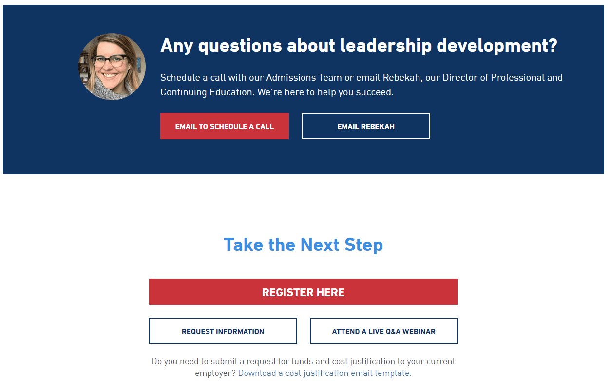
You can see one of our examples here. We made a CTA to match each possible threat level on a landing page we designed for Tufts:
Notice how prospects can pick their comfort level? Request Information is great for cold leads, while Attend a Live Q&A Webinar is reasonable for lukewarm leads. Register Here of course is best for our hot leads.
Experiment with Micro-Conversions
Wait . . . micro-what?
While standard practice is to keep the form as short and sweet as possible, there is another approach that can also be effective – especially in situations where your school or program offers lots of choices.
You can break your conversions down even further with multi-step forms. Of course you have to carefully select questions that are meaningful to your prospects. Otherwise you’ll scare them off with too many fields.
Academy of Art University’s form has a great arrow to draw the eye and useful multi-step fields for prospects searching for “art programs.” These fields make prospects feel they’ll get the most specific and relevant information for their interests. A multi-step form should benefit them, not you. Make sure you follow through with specifics after they provide you with trust.
Why on earth would I make forms longer?
To quote Dr. Robert Cialdini in Influence: The Psychology of Persuasion:
“Once we’ve made a choice, we will encounter personal and interpersonal pressures to behave consistently with that commitment.”
So surprisingly, sometimes multi-step forms will get your prospects more invested to convert. It all depends on asking the right questions.
So what else do I need to know?
Funny you should ask (wink, wink). Through our ongoing research and work with clients, we’ve found that there really is a concrete list of to-do’s when it comes to building successful landing pages for student recruitment.
Download Toolkit and Checklist for Top-Performing Higher Ed Landing Pages


