In higher education, as in traditional consumer marketing, landing pages can be a valuable tool to capture prospects who come in through social and paid media, thereby building your email list and potential customer base.
You probably know the basics of landing page design:
- Visually simple and easy to understand
- Guides viewers to the contact form
- Followed by a “thank you” page with a timeline for getting in touch
For institutions of higher learning, there are a few other unique considerations on top of these general business guidelines. Let’s dive into what those are and how you can create a landing page that excels at converting visitors into leads.
Consider two calls to action.
For much of consumer and business-to-business marketing, conventional wisdom says that a landing page only has one goal: Generally, to collect a prospect’s email address for nurturing further down the funnel. In higher ed, it’s worth considering that some of your users may already be ready to begin the enrollment process. Having two distinct calls to action can help serve audiences at different levels of your enrollment funnel, letting them choose whether to start an application, or simply submit their information to learn more if they aren’t yet ready to commit.

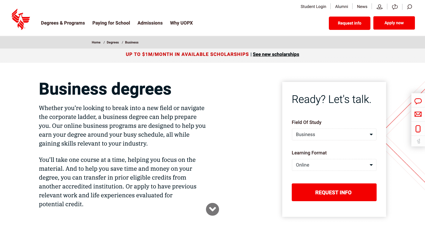
This University of Phoenix landing page has a lead form as its main focus—and it contains two buttons in the header, “Request Info” and “Apply Now.” These two different calls to action are highlighted in a bold red to differentiate them from the rest of the page, and easily let viewers choose whichever option suits them best.
When it comes to form fields, less is more.
Here’s a piece of advice that applies universally to landing pages: Use the page’s design to guide viewers to the contact form, and only require them to fill out what you really need to market to them. Although the average number of form fields on landing pages is 11, shortening your form fields from 11 to 4 can more than double your conversion rate.

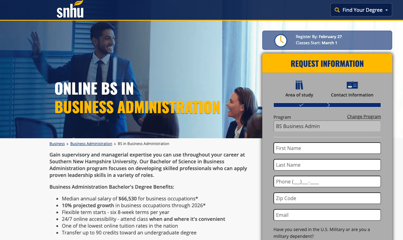
Check out the Southern New Hampshire University Business Administration page. This form requires far less than the average number of form fields—only 6, one of which is pre-filled, plus a selection question—and provides only essential contact and qualifying information, like name, phone, zip, and email. The burden placed on the viewer is low, allowing them to easily answer the questions and enter SNHU’s email nurture.
Make it easy to speak to a human.
Especially with something as personal as higher ed, people sometimes have questions they can’t answer on a website, or want to be reassured by a human before they make a significant financial and life decision to enroll. Contact information, like a phone number or email address, should be clearly visible on your landing page (a header bar is a great place to do that) so that your prospects can reach a person if they need to. And, for an even more personal touch, we recommend ensuring that each lead who submits their information get a call from an enrollment coach. That way, they know the school cares about them and their educational goals, and they have a resource to guide them in making this major decision.
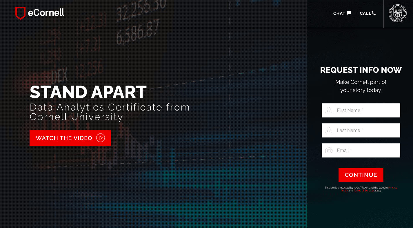
This eCornell landing page is a great example–the user can click on Chat and Call links at the top to connect with a live person who will assist them. We also recommend giving users the option of choosing between communication channels, so they can reach you however they feel most comfortable.

Don’t worry about keeping important content “above the fold.”It’s time to bust this marketing myth: You don’t have to squeeze in all your content “above the fold,” or on the initial screen the user sees when a page loads without having to scroll. While it’s important to keep the form up there to catch the user’s eye, there’s tons of evidence that the majority of site viewers will scroll down “below the fold” and you can absolutely include rich content there for them to discover.
This Purdue Nursing page is a great example; as the viewer scrolls down, they can explore different panes including information on what types of degrees they offer, the program’s accolades, types of potential careers, and more.
Above all, as with any marketing materials, analytics are key to creating a landing page that resonates with your particular audience and builds your pipelines. You should be evaluating your landing page at regular intervals to see what works for your audience. You might find, for example, that you can ask for a couple more form fields from your users without any negative impact to conversion rates. All content marketing guidelines are just that—insights that can help you get started—and we hope ours have helped.
Seem like a lot to manage? At Viv Higher Ed, we specialize in creating custom, end-to-end marketing solutions for institutions of higher learning. Contact us today for a no-cost consult and learn how we can help enhance your landing pages and build you a qualified pipeline of prospective students.
