With so much chatter around accessibility in recent years, it’s easy to become numb to the word or check it off as “done” after a cursory audit. But higher ed marketers who ignore accessibility do so at their peril. Not only are federally funded schools required to have websites that are fully accessible to users with all ranges of abilities, it’s simply the right thing to do to ensure that all current and potential students are able to fully experience your school’s website and get the most from the admissions process and student experience.
After all, if your site isn’t truly accessible for all students, you could be missing out on potential audience members and valuable members of your campus. What’s more, ensuring your site is truly accessible can also help it rank higher in Google searches—and help all users have a better experience, not just those needing special accommodation.
Hopefully these compelling reasons are inspiring you to examine the accessibility of your school’s online properties, if you haven’t already. Think of accessibility as a long-term, continuous process rather than a one-time audit of checking off boxes, since accessibility standards (and your site itself) are constantly being updated. In the short term, though, here are a few key elements to look out for when conducting an audit of your site’s accessibility.
Alt text
You probably know that alternative text, more commonly known as “alt text,” is the little text box that pops up when you hover over an image on a website—and that screen readers for the visually impaired can process to help the user understand what the image is conveying. But you might be surprised to know that many university websites aren’t up to par when it comes to alt text. In a 2017 complaint, Bowling Green State University’s site had images that were missing alt text and videos without appropriate captions.
It’s important to make sure your image descriptions are adding value for the user and conveying something they won’t get through text alone. For example, decorative images—such as images that contribute to the visual styling of the page, reinforce something that’s already present on the page, or are simply there for ambiance—can generally have a null, or empty, alt tag so as not to waste readers’ time. An image of students lounging on the quad, for example, may warrant a null alt tag. Conversely, if a biology department page shows images of different types of rocks to help the reader understand them, it’s probably useful to drop in an alt tag describing what the image is conveying to augment the text.
Contrast
As with alt text, you should be able to get a sense relatively quickly if your site is up to par in terms of contrast (if you don’t already know). To put it in simple terms, contrast refers to the visual contrast between type and background color on the web. If the two shades are too close together, it’ll be hard for colorblind people to read. Having proper contrast also makes it easier for everyone to read a webpage—a great example of how accessibility standards improve sites for all.
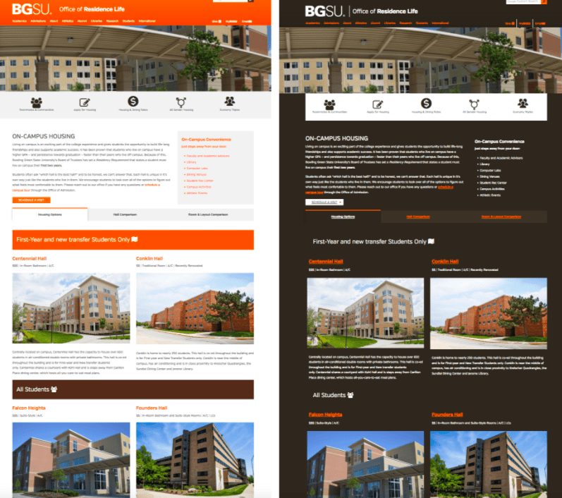
In the complaint mentioned above against Bowling Green State University, the school was called out for their lack of contrast as well, so don’t let this one slide. Here’s a basic example of standard vs. high contrast on their website—the updates to their site included the option to switch from the left to the right option, which is easier for the visually impaired to read.

Source: Inside Higher Ed
Mobile-responsive design
Although responsive design, AKA web design that performs well on mobile, tablet, and desktop formats, has been around for years, a surprising number of designers still primarily focus on the desktop at the expense of the mobile experience. Not only are we all scrolling our phones all day long—making responsiveness an essential element of any site—but also, according to Pew Research, “With fewer options for online access at their disposal, Americans with lower incomes are relying more on smartphones.”
This means that in order for your school’s site to reach those students from economically disadvantaged families, the design must be mobile responsive and allow them to easily view information and complete necessary processes on a smartphone.
Remember, website accessibility is a constant process, but the end goal is worth it—allowing all students and families to fully engage with your school’s digital presence and make the most of their academic experience.
Does accessibility seem like a lot to manage? Viv Higher Ed has the expertise on our full-service team to help you ensure your site complies with standards and is accessible to all. Contact us today for a free consult and see how we can help. Schedule a consult now.
