From webpages to emails and blog posts, eye-catching images are essential to capturing your readers’ imaginations and drawing them into your school’s site. Especially with the ways the Internet is changing, site visitors don’t have the patience to scroll through long blocks of text. According to this Medium article, the vast majority–81 percent!–of people only skim the content they read online.
High-quality imagery is worth your while as it can reinforce the messages you want to get across even if the reader is only skimming. And images lead to higher engagement—in fact, content that includes imagery provides 650 percent more user engagement than content with no images.
Need some inspiration on how to revamp your content marketing materials? Read on for more on how to make the most of three common image formats.
Finding stock photos that shine
Stock photos tend to get a bad rap for being overly generic, with no authentic connection to the school experience they’re portraying. Bland stock photos may remind the user of an ad, or simply cause their eyes to gloss over, and lead to disengagement.
However, stock photos can have a place in a well-rounded higher ed marketing strategy. When used well, these images can help make a page more engaging by adding a graphic element, especially when illustrating an abstract concept that photos of the school’s campus community wouldn’t demonstrate as well.
Find a site that has a variety of dynamic images, showing different ages, races, and abilities. And try switching up your search terms if you aren’t getting the images you want at first. Unique stock photos are out there, so invest some time in scrolling through results to find gems. We pay for Envato, but it’s also worth checking free sites like Pixabay, Unsplash, and Pexels to see what’s out there.

Searching for simply “online learning” recently yielded lots of results with K-12 aged children, but we were looking for higher ed examples.

So, we changed our search terms to “online learning adult student” and the results much more accurately reflected what we were looking for. Don’t be afraid to switch up keywords!

Here’s an example of a stock photo that we liked–it’s colorful and shows a student in action in their future career as an educator. The expressions look genuine, everyone’s engaged, and it shows racial and gender diversity as well.
Capturing campus community photos on a budget
You already know that images of your school’s campus, students, and community are some of the most compelling tools in a higher ed content marketer’s arsenal. Especially when it comes to enrollment marketing, photos of your school’s campus reinforce your brand, showcase your facilities, and help prospective students imagine themselves in the shoes of the students portrayed on the site.
What you might not know is that it’s far easier and more cost-effective to capture photos for your department than you may think. Don’t have a fancy camera? Depending on the medium–especially if you’re snapping pictures for social media–a phone can take phenomenal photos these days. If you have an iPhone, we suggest trying out portrait mode with students or teachers in front of a campus backdrop to highlight your campus’s commitment to teaching and learning. Finding models shouldn’t be hard, either–we recently completed a campus photoshoot with one client in under two hours, simply recruiting a few students through a campus contact who were happy to participate.
One pitfall to watch out for is legal approval of photos. You may be surprised at how strict rules and photo rights conditions can be. Always check with your legal office what you can use, and don’t hesitate to contact us if you want help navigating the approval process.
Images of people can be best to communicate emotion and help prospective students see themselves at your school. Sometimes, though, buildings are enough to show institutional identity and get students excited. We love this example from the Columbia website that offers a view of the iconic Low Library, with architecture that reinforces the school’s prestigious brand to the viewer.

And here’s a great example of utilizing student photos, from the University of Pennsylvania. These three authentic student photos help the viewer get a better sense of the campus community and envision themselves as a part of it. In 2020, it’s wise to err on the side of caution and ensure that any campus shots featuring students or faculty shows social distancing–and when in doubt, just show one student to better represent the current climate. This example also shows the power of combining images and text to create one unified message.

Using icons and creative design to add visual interest
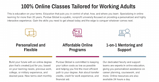
Simple line drawings are often used to help illustrate shorter chunks of text. These icons can help explain a quick sequence of ideas quickly, like the steps students must take to enroll, or the various value propositions of a certain program.
Icons are one of the most difficult visual elements to master, and should be simply designed and used judiciously–overwhelming your audience with graphic elements can be off-putting. You want to make your content easier to digest, rather than visually confusing. We recommend using professional graphic design support to ensure that icons are used to enhance a website, rather than make it more chaotic.
Below is an example of effective icon usage from Purdue Global, showing how colorful icons can act almost as bullet points that make a page easily legible–and engaging–for the reader.

Let Us Help You
Want to take your school’s content marketing imagery to the next level? Viv specializes in developing a compelling marketing strategy for schools like yours. Let us help you with content that gets your message across, builds your school’s brand, and drives students through the lead funnel. Schedule a consult now.
